Charles Benjamin
Filler
Ethics and aesthetics are one and the same.
- Ludwig Wittgenstein
Philosophy should really be written as a kind of poetry.
- Ludwig Wittgenstein
In an attempt at making the two preceding quotes make sense with visual arts I made a third one:
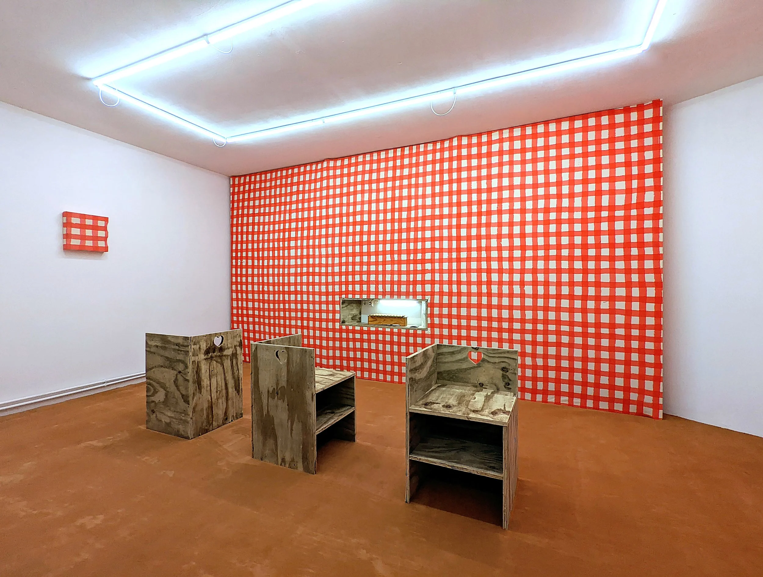
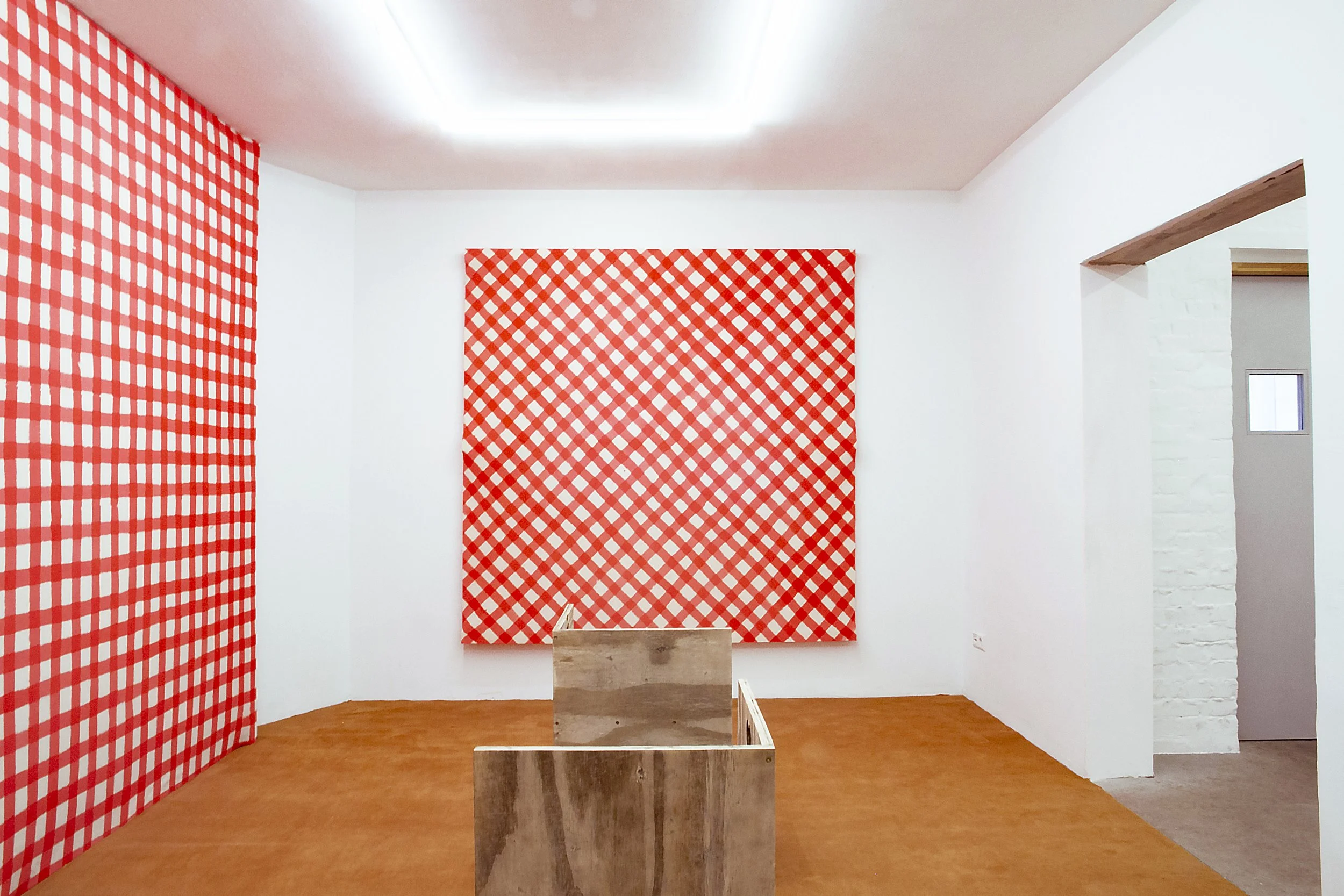
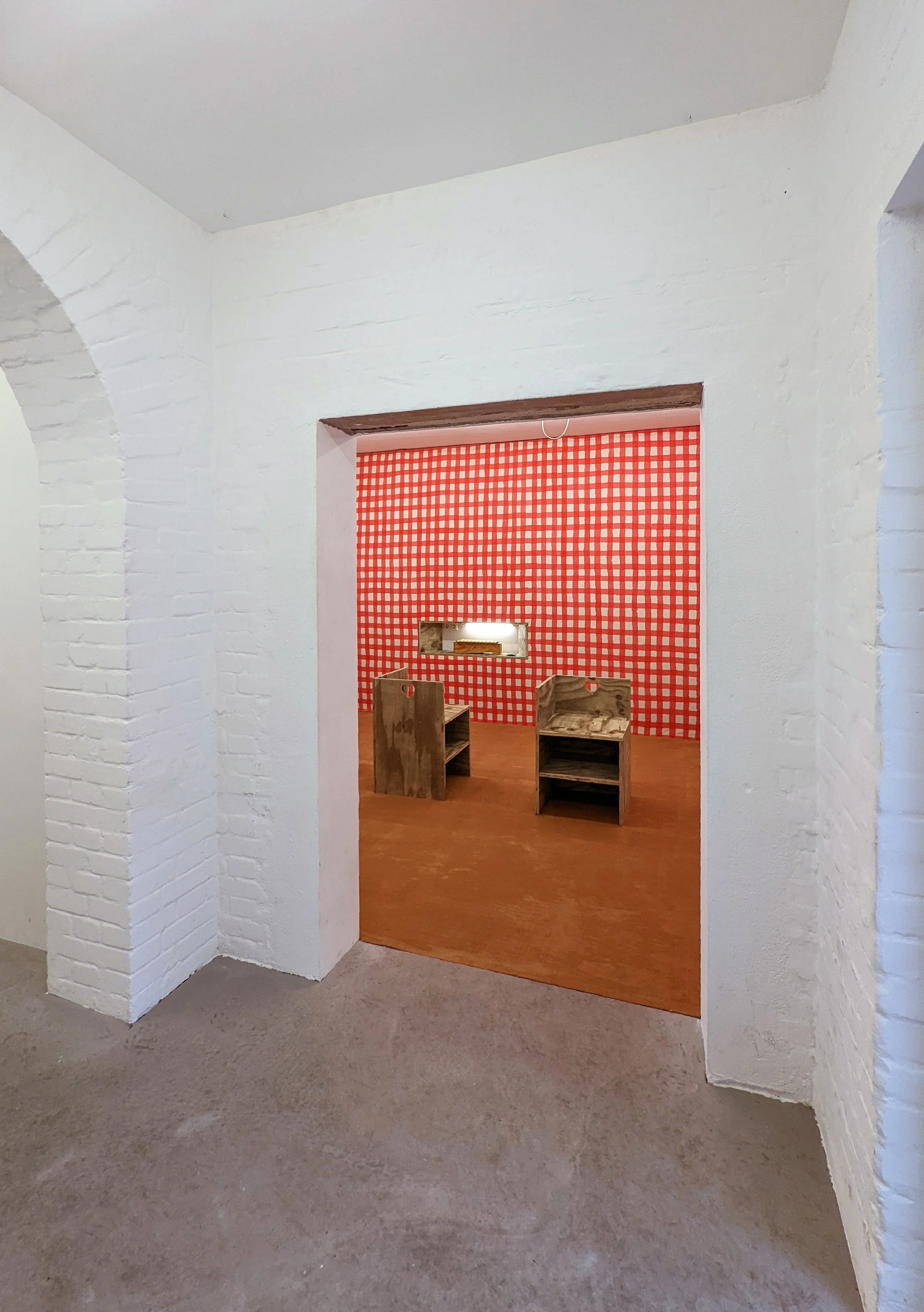
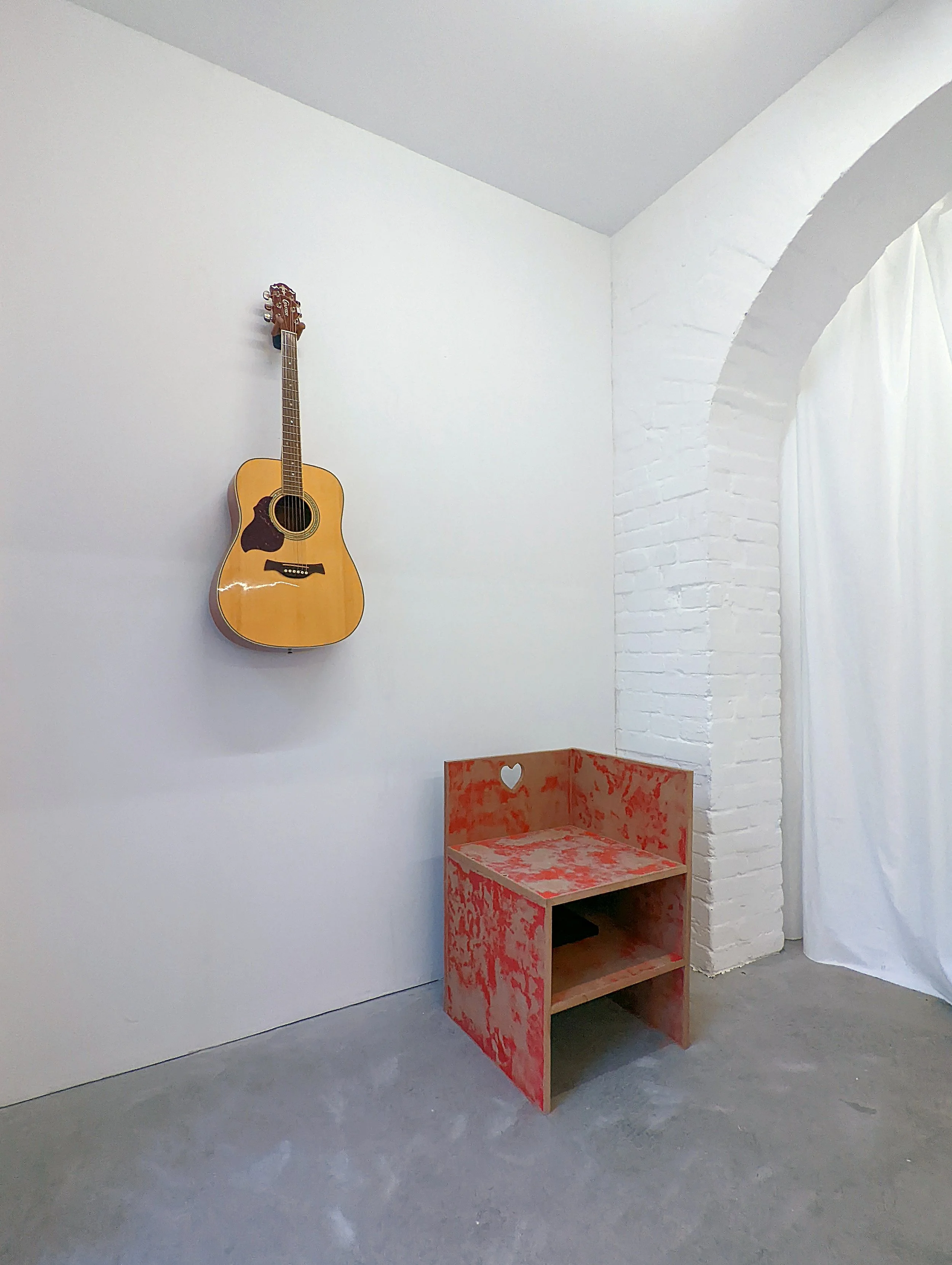
Visual art should really be made as a kind of interior design.
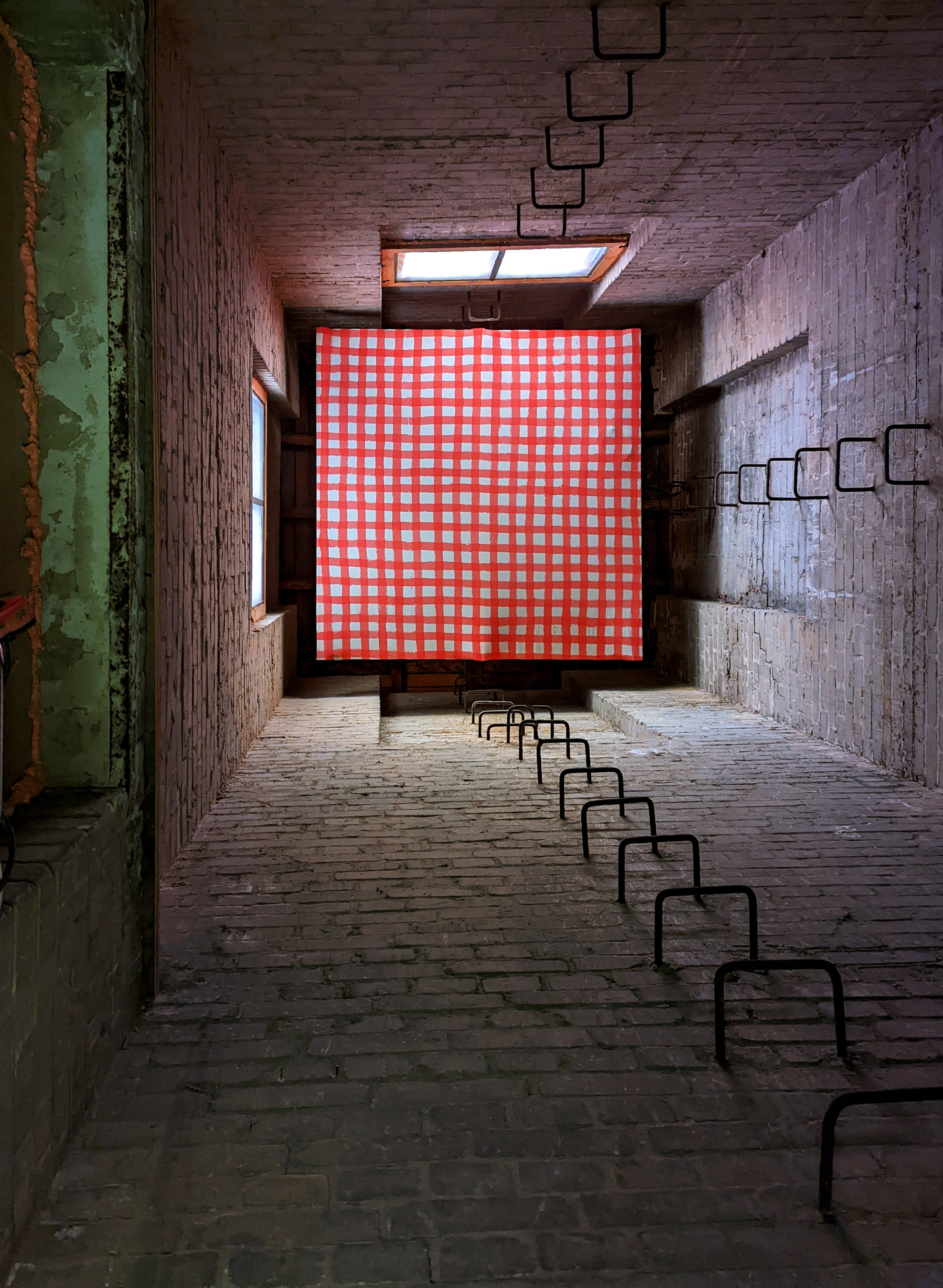
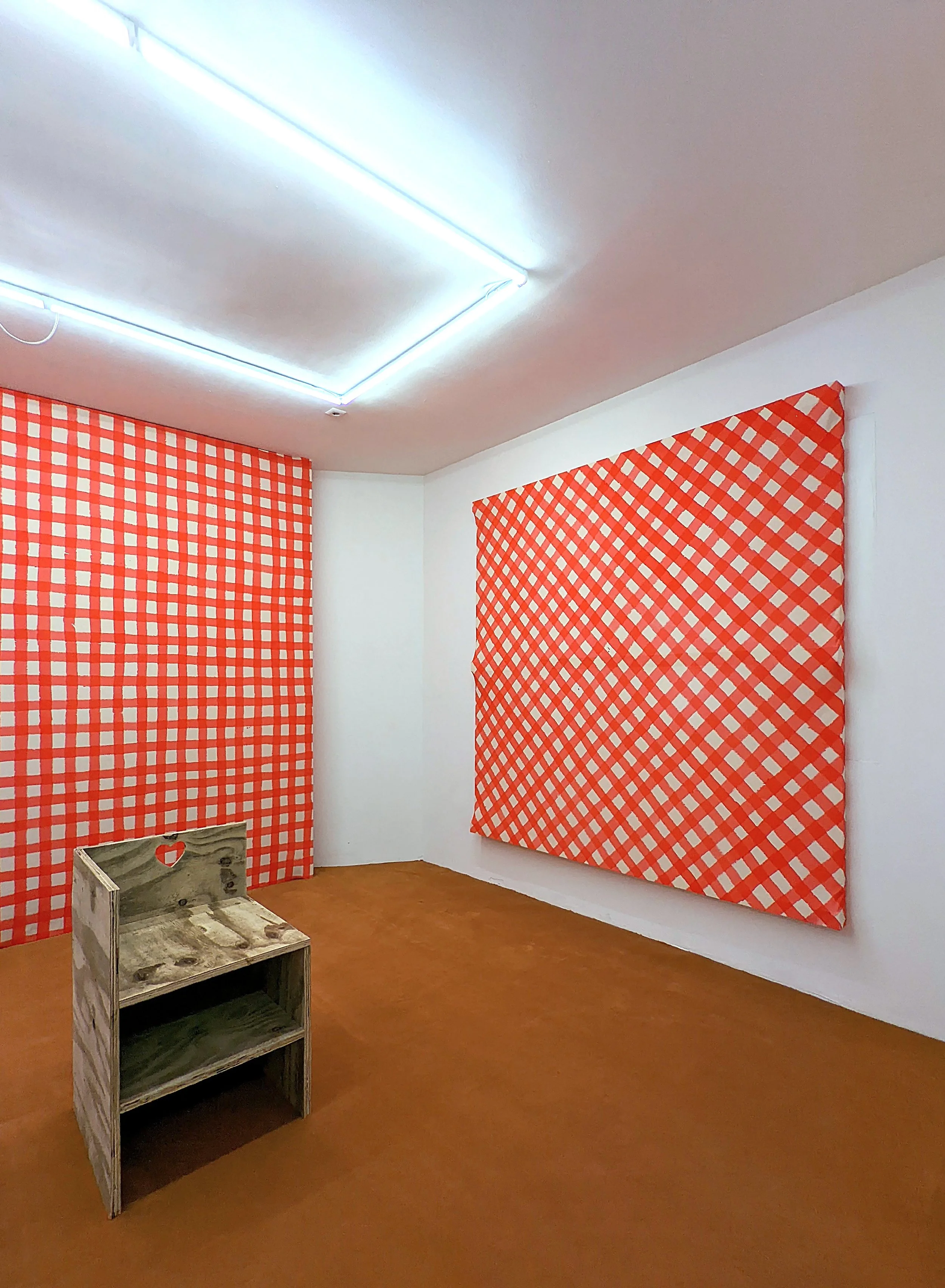
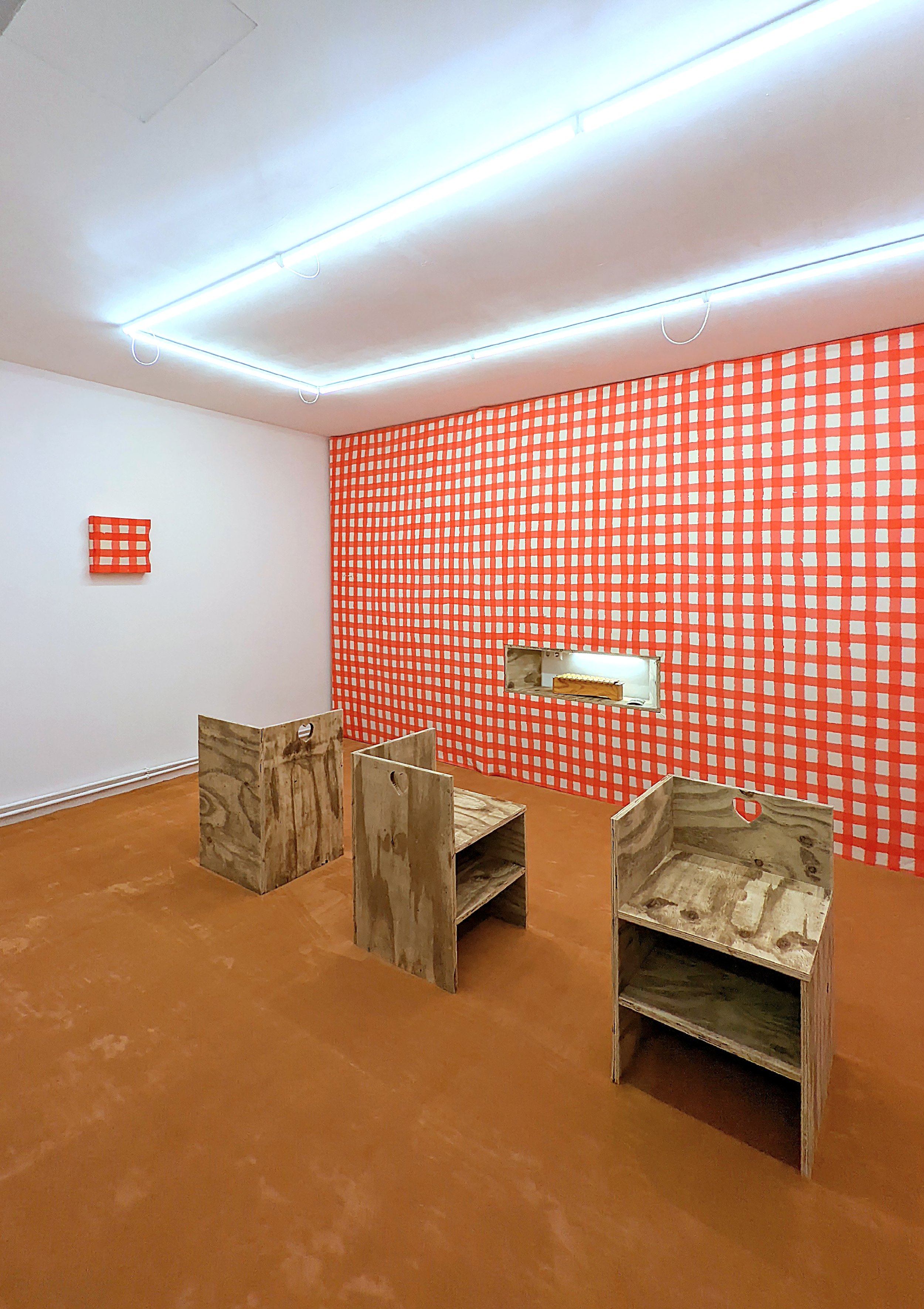
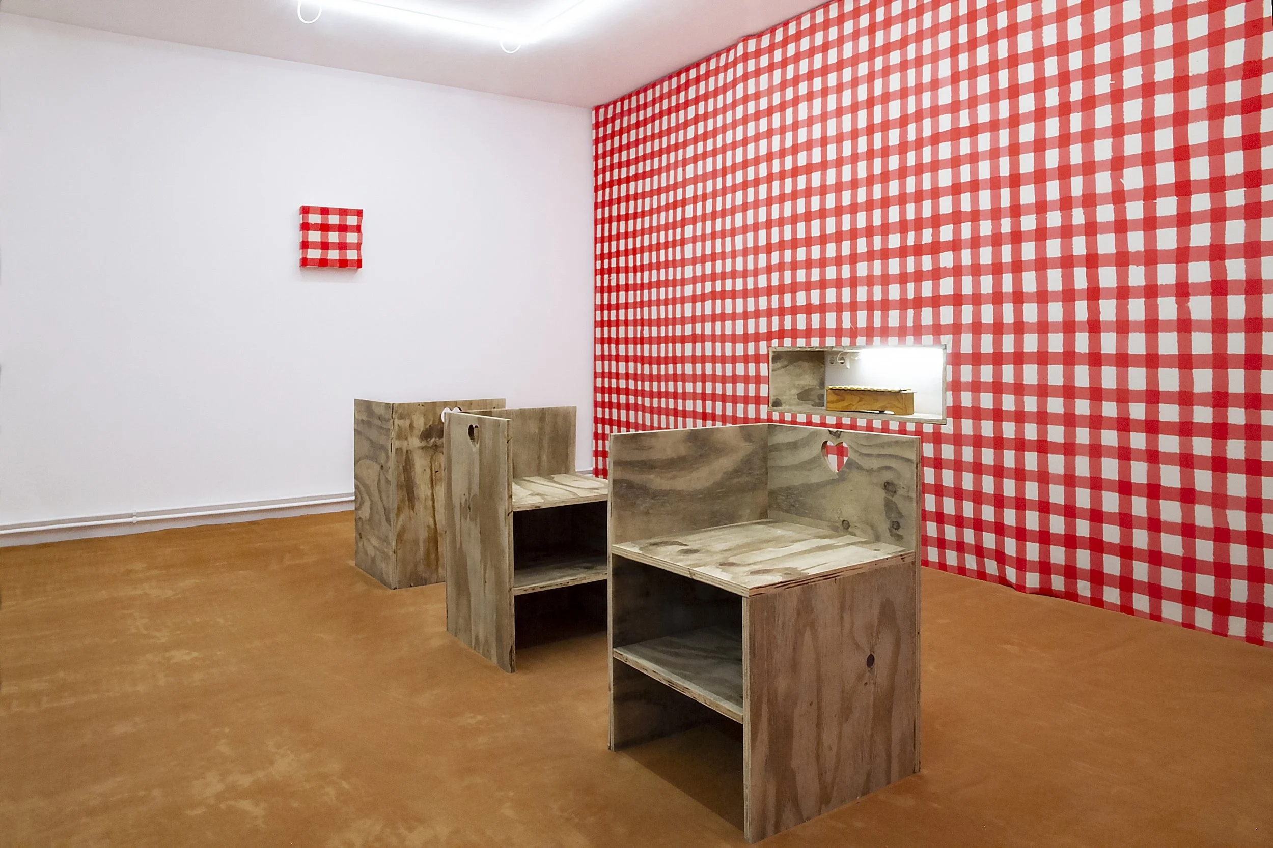
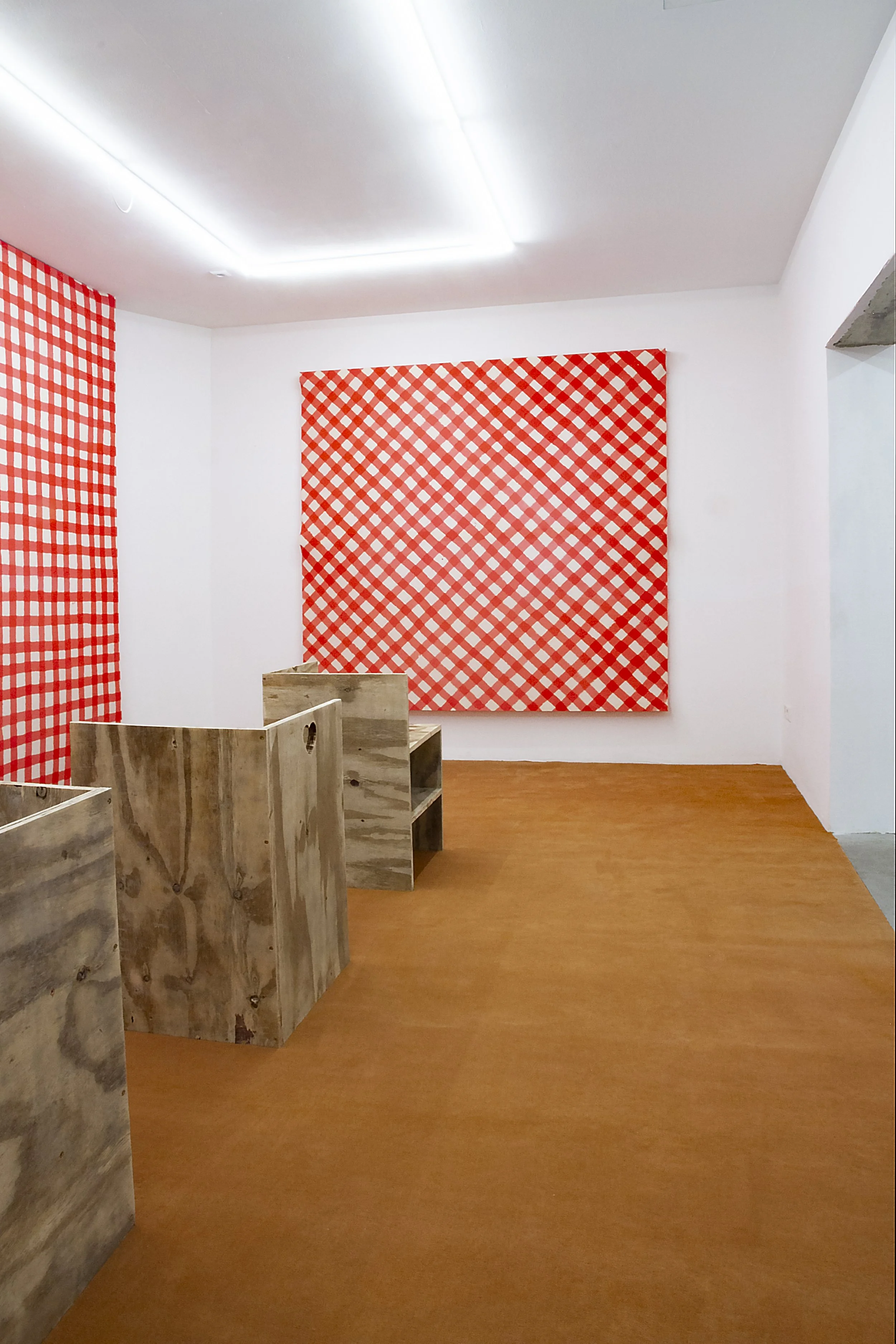
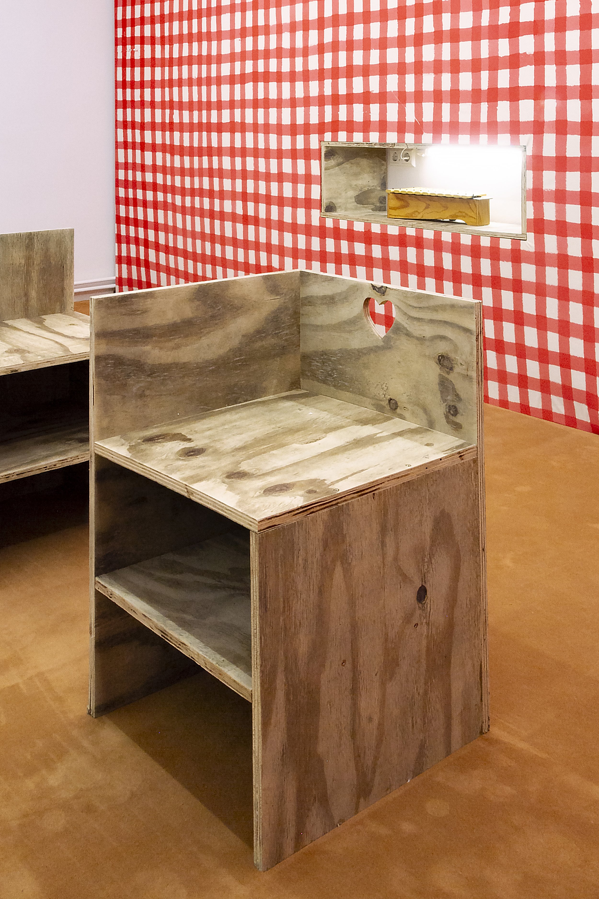
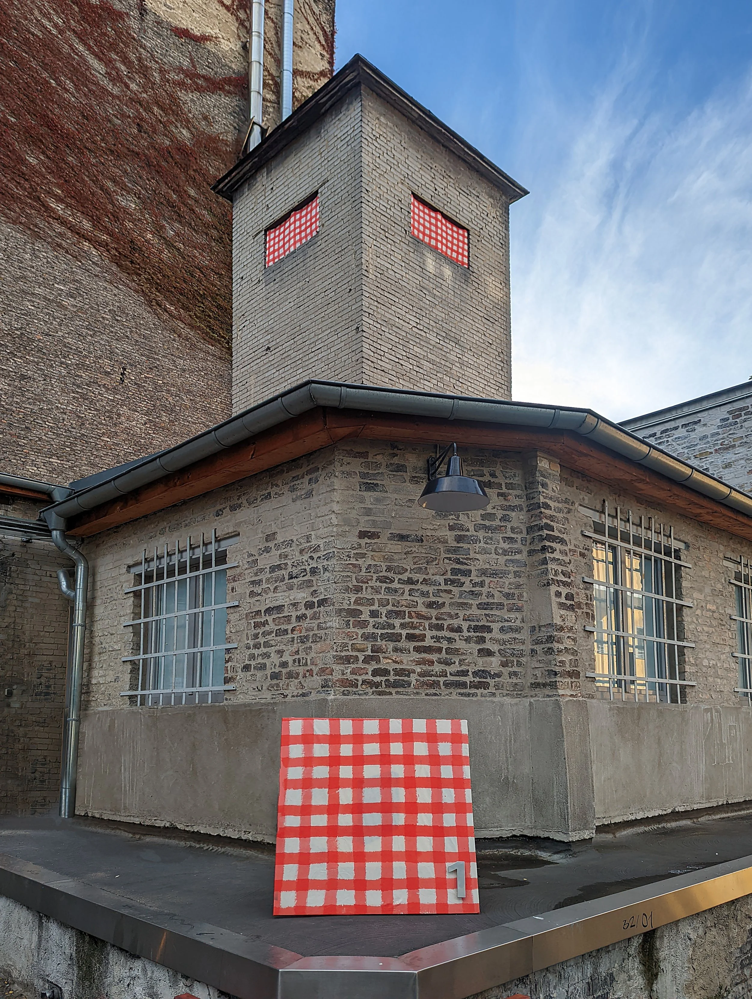
Although “interior design” and “decor” aren’t the most popular terms when describing art, I am not using them with cynicism here. What I have is a kind of confusion about emptiness as a quality. Often decorative seems to mean empty. A sofa-painting is called that because matching the sofa in itself makes it less likely to do anything else. Yet much art from recent (and not so recent) history seem to be attempts at emptiness. To make something open is in a sense making something empty. Minimalism seemed in part to be about this. Is this not the same emptiness as in the sofa-painting? If ethics and aesthetics are one and the same, can there be a decorative gesture without an ethical or philosophical dimension? More than decoration itself, gingham feels to me like a kind of symbol of decor. I find it interesting that something so familiar doesn’t carry a single clear connotation. It is common within Bavarian and Austrian biergarten culture. Brigitte Bardot used pink gingham for her wedding dress in 1959. My parents had a bed from the Swedish luxury bed brand Hästens, which uses gingham as signature, maybe as a way to evoke a pyjama? Bruce Naumann used it both as table cloth and shirt for the documentation of his work Eating My Words(1966-1967). I’m guessing that gingham for Naumann meant something like picnic. French marmelade brand Bonne Maman uses it for their lids to connote homemade. It seems gingham has and is being used almost arbitrarily. It has no political nor class affiliation, it isn’t particularly masculine or feminine and it isn’t at all sensitive to time passing or fashion. Using gingham as motif is for me about Niele Toroni. Or rather, Niele Toroni is about gingham. Toroni’s entire oeuvre from the early 60’s to present has consisted of 50mm brush imprints at regular diagonal intervals of 30cm. Nothing else. To me this is a stubborn decorative gesture which affirms gingham. I think of gingham as a thing which allows for Toroni’s work. A kind of silent affirmation that there is little to say and more than words. This feels true about Agnes Martin’s grids, Malevich’s square, Buren’s stripes, Kusama’s dots etc. A kind of refusal to leave silence empty. In this sense gingham seems to mean mostly not white. It’s an empty filler. It is anti-minimalistic. It’s More assertive and less concerned with becoming or potential than the empty canvas. Less concerned with neutrality than the white cube. It somehow truly lacks existential angst.
Charles Benjamin, 2022